Following up on yesterday's post comparing Big Bear home sale numbers from 2014 to 2015, here is the longer term look that I promised. Let's start with the graph below showing the average and median sale prices of Big Bear homes going back to 2006.
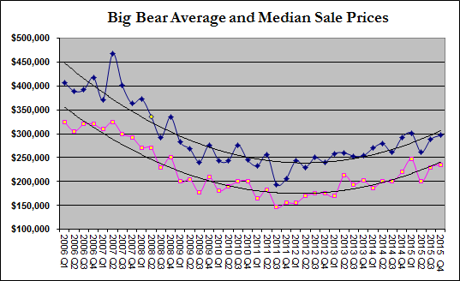
Looking at the trend lines, one can see the precipitous fall from the high market prices in 2006-2007 to their lows in the third quarter of 2011. From there, you can see the steady climb we've been experiencing. Note that although Big Bear homes have appreciated about 50% from market lows, we are still 25% to 30% below peak prices.
When we look at the Price Per Square Foot measures, we see the same trend.
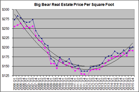
You can see that the price per square foot measures fell about 50% from the market peak and have rebounded almost halfway back from their lows. Since 2011, the price per square foot has risen almost 50%, mirroring the trend we saw in looking at sales prices.
So from a longer term perspective, we can see the apparent upward trajectory of the Big Bear real estate market. Home prices are on the rebound and Big Bear homes sales are showing strength heading into the New Year.
But as mentioned in yesterday's post, and in looking closely at the graph above, you can see that the rate of appreciation has slowed somewhat over the past year.
More on that in the my next Big Bear real estate blog post!